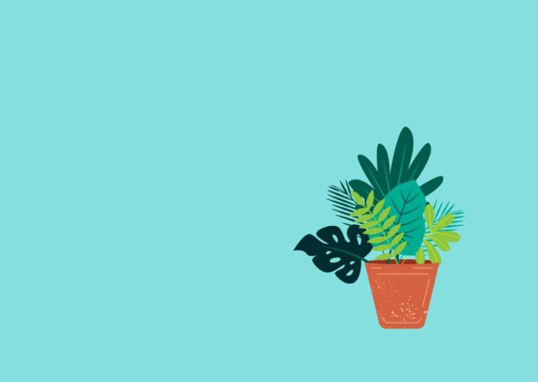
1. Cấu trúc HTML của chậu cây
Mỗi lá cây là một ảnh riêng để có thể áp dụng animation khác nhau:
<div class="pots">
  <img class="pot" src="plants/pot.png" alt="Pot">
  <img class="top-pot" src="plants/top-pot.png" alt="Top Pot">
  <img class="leaf leaf-1" src="plants/leaf-1.png" alt="Leaf 1">
  <img class="leaf leaf-2" src="plants/leaf-2.png" alt="Leaf 2">
  <img class="leaf leaf-3" src="plants/leaf-3.png" alt="Leaf 3">
  <img class="leaf leaf-4" src="plants/leaf-4.png" alt="Leaf 4">
  <img class="leaf leaf-5" src="plants/leaf-5.png" alt="Leaf 5">
  <img class="leaf leaf-6" src="plants/leaf-6.png" alt="Leaf 6">
  <img class="leaf leaf-7" src="plants/leaf-7.png" alt="Leaf 7">
</div>
2. CSS hiệu ứng đung đưa lá cây
.pots {
  position: absolute;
  width: 90px;
  bottom: 20px;
  right: 10%;
}

.pots img {
  position: absolute;
}

.pots .pot {
  bottom: 0;
  left: 0;
  z-index: 10;
}

.pots .top-pot {
  bottom: 77px;
  left: 0;
  z-index: 1;
}

.pots .leaf {
  bottom: 75px;
  max-width: none;
}

/* Animation cho từng nhánh lá */
@keyframes swing-1 { 50% { transform: rotate(1deg); } }
@keyframes swing-2 { 50% { transform: rotate(-2deg); } }
@keyframes swing-3 { 50% { transform: rotate(3deg); } }
@keyframes swing-4 { 50% { transform: rotate(-4deg); } }
@keyframes swing-5 { 50% { transform: rotate(5deg); } }
@keyframes swing-6 { 50% { transform: rotate(-6deg); } }
@keyframes swing-7 { 50% { transform: rotate(7deg); } }

/* Các lá cây */
.pots .leaf-1 {
  width: 100px;
  right: 20%;
  z-index: 9;
  transform-origin: right bottom;
  animation: swing-1 5s linear infinite;
}

.pots .leaf-2 {
  width: 100px;
  right: -20%;
  z-index: 8;
  transform-origin: bottom;
  animation: swing-2 5s linear infinite;
}

.pots .leaf-3 {
  width: 150px;
  right: 65%;
  z-index: 7;
  transform-origin: right bottom;
  animation: swing-3 5s linear infinite;
}

.pots .leaf-4 {
  width: 120px;
  right: -75%;
  z-index: 6;
  transform-origin: left bottom;
  animation: swing-4 5s linear infinite;
}

.pots .leaf-5 {
  width: 160px;
  left: -45%;
  z-index: 5;
  transform-origin: bottom;
  animation: swing-5 5s linear infinite;
}

.pots .leaf-6 {
  width: 140px;
  left: 45%;
  z-index: 4;
  transform-origin: left bottom;
  animation: swing-6 5s linear infinite;
}

.pots .leaf-7 {
  width: 130px;
  right: 45%;
  z-index: 3;
  transform-origin: right bottom;
  animation: swing-7 5s linear infinite;
}
3. Gợi ý thêm
- Có thể thay ảnh bằng SVG để tăng độ sắc nét và giảm dung lượng
- Có thể dùng
transform: rotateZ()kết hợp vớihoverhoặcscrollđể tăng tương tác - Thêm
transition-timing-function: ease-in-outđể chuyển động tự nhiên hơn
Kết luận
Không cần After Effect hay JavaScript – bạn vẫn có thể tạo hiệu ứng đung đưa mượt mà cho giao diện bằng CSS thuần. Thủ thuật này phù hợp để tạo điểm nhấn cho UI, đặc biệt là những website mang phong cách gần gũi, thiên nhiên hoặc mang tính cá nhân hóa cao.


Bình luận