
Mục lục
Kỹ thuật này giúp bạn:
- Tạo hiệu ứng tick mượt mà nhờ SVG
- Tăng độ nhận diện thương hiệu bằng UI tùy biến
- Giữ code lightweight, không gây nặng trang
- Dễ dàng mở rộng sau này (theme màu, animation, icon…)
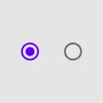
Demo Checkbox SVG
HTML – Sử Dụng SVG Làm Icon Tick
Bạn dùng SVG để làm biểu tượng cho Checkbox.
<svg class="checkbox-symbol">
    <symbol id="check" viewbox="0 0 12 10">
        <polyline points="1.5 6 4.5 9 10.5 1" stroke-linecap="round" stroke-linejoin="round" stroke-width="2"></polyline>
    </symbol>
</svg>
<div class="checkbox-container">
    <input class="checkbox-input" id="apples" type="checkbox" />
    <label class="checkbox" for="apples">
        <span>
            <svg width="12px" height="10px">
                <use xlink:href="#check"></use>
            </svg>
        </span>
        <span>Apples</span>
    </label>
    <input class="checkbox-input" id="oranges" type="checkbox" />
    <label class="checkbox" for="oranges">
        <span>
            <svg width="12px" height="10px">
                <use xlink:href="#check"></use>
            </svg>
        </span>
        <span>Oranges</span>
    </label>
</div>
CSS – Tạo Hiệu Ứng Mượt, Tick Bật Nhảy
CSS như sau.
.checkbox-symbol {
    position: absolute;
    width: 0;
    height: 0;
    pointer-events: none;
    user-select: none;
}

.checkbox-container {
    box-sizing: border-box;
    background: #ffffff;
    color: #222;
    height: 64px;
    display: flex;
    justify-content: center;
    align-items: center;
    flex-flow: row wrap;
}

.checkbox-container * {
    box-sizing: border-box;
}

.checkbox-input {
    position: absolute;
    visibility: hidden;
}

.checkbox {
    user-select: none;
    cursor: pointer;
    padding: 6px 8px;
    border-radius: 6px;
    overflow: hidden;
    transition: all 0.3s ease;
    display: flex;
}

.checkbox:not(:last-child) {
    margin-right: 6px;
}

.checkbox:hover {
    background: rgba(0, 119, 255, 0.06);
}

.checkbox span {
    vertical-align: middle;
    transform: translate3d(0, 0, 0);
}

.checkbox span:first-child {
    position: relative;
    flex: 0 0 18px;
    width: 18px;
    height: 18px;
    border-radius: 4px;
    transform: scale(1);
    border: 1px solid #cccfdb;
    transition: all 0.3s ease;
}

.checkbox span:first-child svg {
    position: absolute;
    top: 3px;
    left: 2px;
    fill: none;
    stroke: #fff;
    stroke-dasharray: 16px;
    stroke-dashoffset: 16px;
    transition: all 0.3s ease;
    transform: translate3d(0, 0, 0);
}

.checkbox span:last-child {
    padding-left: 8px;
    line-height: 18px;
}

.checkbox:hover span:first-child {
    border-color: #0077ff;
}

.checkbox-input:checked + .checkbox span:first-child {
    background: #0077ff;
    border-color: #0077ff;
    animation: zoom-in-out 0.3s ease;
}

.checkbox-input:checked + .checkbox span:first-child svg {
    stroke-dashoffset: 0;
}

@keyframes zoom-in-out {
    50% {
        transform: scale(0.9);
    }
}
Lời Kết
Chỉ với vài dòng HTML + CSS, bạn đã biến Checkbox mặc định thành một thành phần UI xịn sò chuẩn UI/UX designer luôn. Cách này cực phù hợp cho:
- Form đăng ký
- Bộ lọc (filter)
- Setting panel
- Giao diện web/app cần brand identity rõ ràng
Chúc các bạn thành công!


Bình luận