Mục lục
Trong bài viết này, chúng ta sẽ tạo một nhóm radio button với SVG, có hiệu ứng chuyển màu, thu phóng mượt mà và hoàn toàn không cần dùng thư viện ngoài.
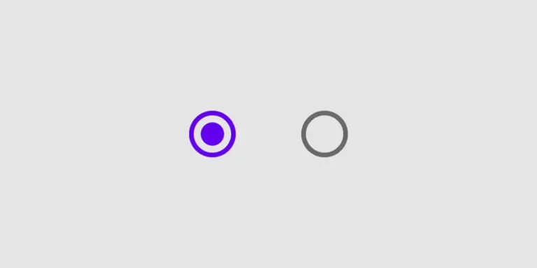
Demo Radio Button SVG
HTML – Tạo cấu trúc Radio Button với SVG
Đầu tiên, chúng ta định nghĩa một <symbol> SVG để làm “dấu chấm” bên trong radio. Sau đó, mỗi radio sẽ gồm một <input type="radio"> ẩn đi và một <label> trông như một nút radio custom.
<svg class="radio-symbol">
    <symbol id="radio-dot" viewBox="0 0 16 16">
        <circle cx="8" cy="8" r="4"></circle>
    </symbol>
</svg>

<div class="radio-container">
    <input class="radio-input" type="radio" name="plan" id="basic" checked />
    <label class="radio" for="basic">
        <span>
            <svg width="16" height="16">
                <use xlink:href="#radio-dot"></use>
            </svg>
        </span>
        <span>Gói Basic</span>
    </label>

    <input class="radio-input" type="radio" name="plan" id="pro" />
    <label class="radio" for="pro">
        <span>
            <svg width="16" height="16">
                <use xlink:href="#radio-dot"></use>
            </svg>
        </span>
        <span>Gói Pro</span>
    </label>

    <input class="radio-input" type="radio" name="plan" id="vip" />
    <label class="radio" for="vip">
        <span>
            <svg width="16" height="16">
                <use xlink:href="#radio-dot"></use>
            </svg>
        </span>
        <span>Gói VIP</span>
    </label>
</div>
CSS – Style Radio Button với hiệu ứng mượt mà
Tiếp theo, chúng ta dùng CSS để:
- Ẩn radio mặc định của trình duyệt.
- Tạo viền tròn cho radio custom.
- Dùng SVG để làm “dấu chấm” bên trong, scale từ 0 → 1 khi được chọn.
- Thêm hover + animation nhẹ để UI trông hiện đại hơn.
.radio-symbol {
    position: absolute;
    width: 0;
    height: 0;
    pointer-events: none;
    user-select: none;
}

/* Container bao quanh nhóm radio */
.radio-container {
    box-sizing: border-box;
    background: #ffffff;
    color: #222;
    padding: 12px 16px;
    display: flex;
    justify-content: center;
    align-items: center;
    flex-flow: row wrap;
    gap: 8px;
}

.radio-container * {
    box-sizing: border-box;
}

/* Ẩn radio mặc định */
.radio-input {
    position: absolute;
    visibility: hidden;
}

/* Label đóng vai trò là radio custom */
.radio {
    user-select: none;
    cursor: pointer;
    padding: 6px 10px;
    border-radius: 999px;
    overflow: hidden;
    transition: all 0.25s ease;
    display: inline-flex;
    align-items: center;
}

/* Khoảng cách giữa các radio */
.radio:not(:last-child) {
    margin-right: 2px;
}

/* Hover nhẹ cho cảm giác tương tác */
.radio:hover {
    background: rgba(0, 119, 255, 0.06);
}

/* Span bọc phần icon + text */
.radio span {
    vertical-align: middle;
    transform: translate3d(0, 0, 0);
}

/* Vòng tròn bên ngoài radio */
.radio span:first-child {
    position: relative;
    flex: 0 0 18px;
    width: 18px;
    height: 18px;
    border-radius: 50%;
    transform: scale(1);
    border: 1px solid #cccfdb;
    transition: all 0.25s ease;
    display: inline-flex;
    align-items: center;
    justify-content: center;
}

/* SVG bên trong (dấu chấm) */
.radio span:first-child svg {
    display: block;
    overflow: visible;
}

.radio span:first-child svg use {
    fill: #0077ff;
    transform-origin: 50% 50%;
    transform: scale(0);
    transition: transform 0.25s ease;
}

/* Text bên phải */
.radio span:last-child {
    padding-left: 8px;
    line-height: 18px;
    font-size: 14px;
}

/* Hover đổi màu viền */
.radio:hover span:first-child {
    border-color: #0077ff;
}

/* Khi được chọn */
.radio-input:checked + .radio span:first-child {
    border-color: #0077ff;
    background: rgba(0, 119, 255, 0.06);
}

/* Dấu chấm SVG bung ra */
.radio-input:checked + .radio span:first-child svg use {
    transform: scale(1);
}

/* Optional: hiệu ứng "nảy" nhẹ khi chọn */
.radio-input:checked + .radio {
    animation: radio-bounce 0.25s ease;
}

@keyframes radio-bounce {
    50% {
        transform: translateY(-1px);
    }
}
Giải thích nhanh cách Custom Radio Button bằng SVG
- SVG <symbol>: định nghĩa một hình tròn (dấu chấm) và tái sử dụng nhiều lần với
<use>, giúp code gọn hơn. - Input radio ẩn đi: chúng ta vẫn dùng radio chuẩn của HTML để đảm bảo accessibility, chỉ là không hiển thị UI mặc định.
- Label làm UI chính: click vào label sẽ check radio tương ứng nhờ thuộc tính
for. - Hiệu ứng scale: khi
.radio-input:checked, SVG bên trong được scale từ 0 → 1, tạo cảm giác tick nhẹ nhàng.
Với kỹ thuật Custom Radio Button bằng SVG này, bạn có thể áp dụng cho form đăng ký, lựa chọn gói dịch vụ, filter, settings… và giữ giao diện đồng bộ với phong cách thiết kế của bạn.
Chúc các bạn thành công!


Bình luận